
如何用 Matplotlib imshow 画矩阵数据
最近在研究 two time correlation function, 所以很多时候需要处理在 K 空间下的不同时间的关联函数,其中一个小点,我也是第一次发现,虽然只是小的参数选择,但是如果没有留意很容易张冠李戴得到完全相反的结果。这个帖子记录下自己的结果,希望也帮助大家可视化矩阵数据。
Matplotlib imshow default
通常在 Python 中,我们常用 Matplotlib 做可视化,画矩阵数据最常用的就是 imshow 函数. imshow 函数用官方文档的说法就是对 2D 数据做可视化的。
Display data as an image; i.e. on a 2D regular raster.
The input may either be actual RGB(A) data, or 2D scalar data, which will be rendered as a pseudocolor image.
所以往往我们会这样可视化,
import numpy as np
import matplotlib.pyplot as plt

# create testing data which is 4x5 data
mat = np.arange(20).reshape(4,5)
print(mat)

# Save Image Function
fig = plt.figure(figsize=(10,8))
ax = plt.gca()
cax = plt.imshow(mat, cmap='viridis')
# set up colorbar
cbar = plt.colorbar(cax, extend='both', drawedges = False)
cbar.set_label('Intensity',size=36, weight =  'bold')
cbar.ax.tick_params( labelsize=18 )
cbar.minorticks_on()
# set up axis labels
ticks=np.arange(0,mat.shape[0],1)
## For x ticks
plt.xticks(ticks, fontsize=12, fontweight = 'bold')
ax.set_xticklabels(ticks)
## For y ticks
plt.yticks(ticks, fontsize=12, fontweight = 'bold')
ax.set_yticklabels(ticks)
plt.savefig('test.png', dpi = 300)
plt.close()
具体效果如下图,
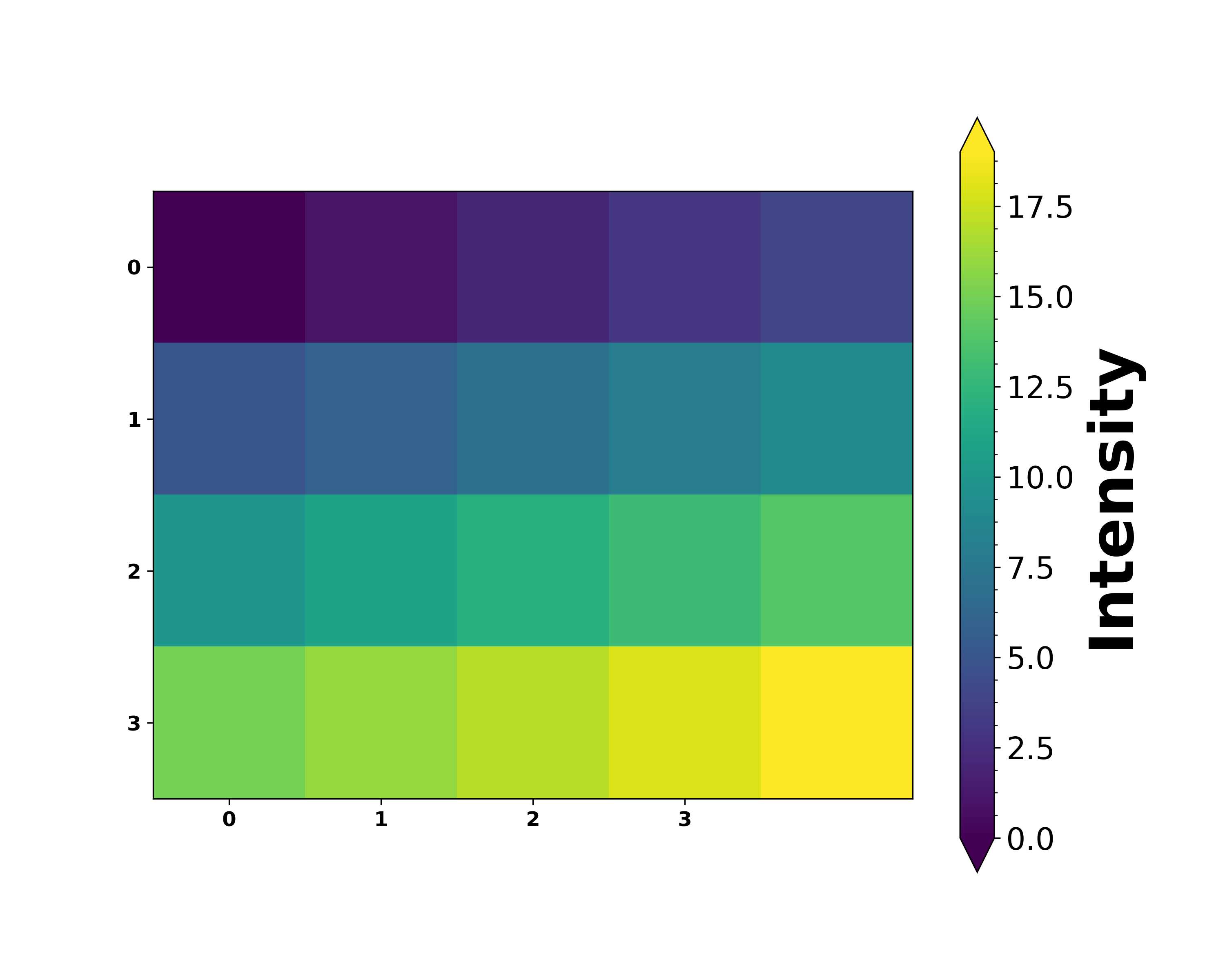
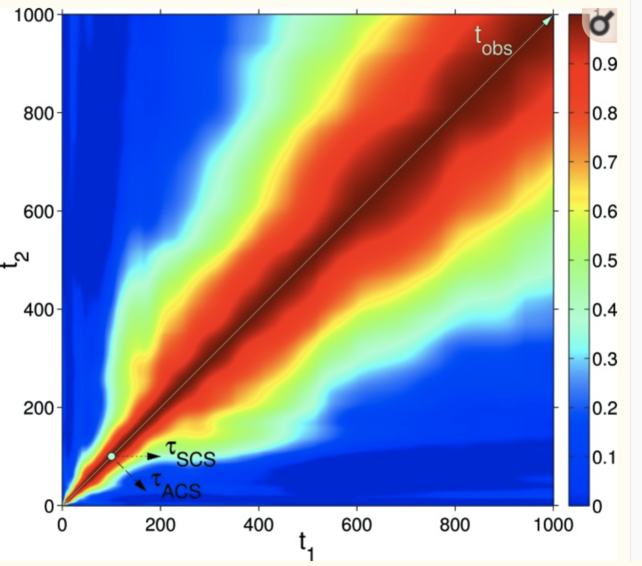
但是这个图在很多时候其实并不是我们想要得,以 two time correlation function 为例,这个图最大的问题是它的 origin point 不对。我们希望的 origin 在左下角,但是这个图在左上角。比如常见的 two time correlation function 如下图所示,来自 On the use of two-time correlation functions for X-ray photon correlation spectroscopy data analysis
Matplotlib imshow lower
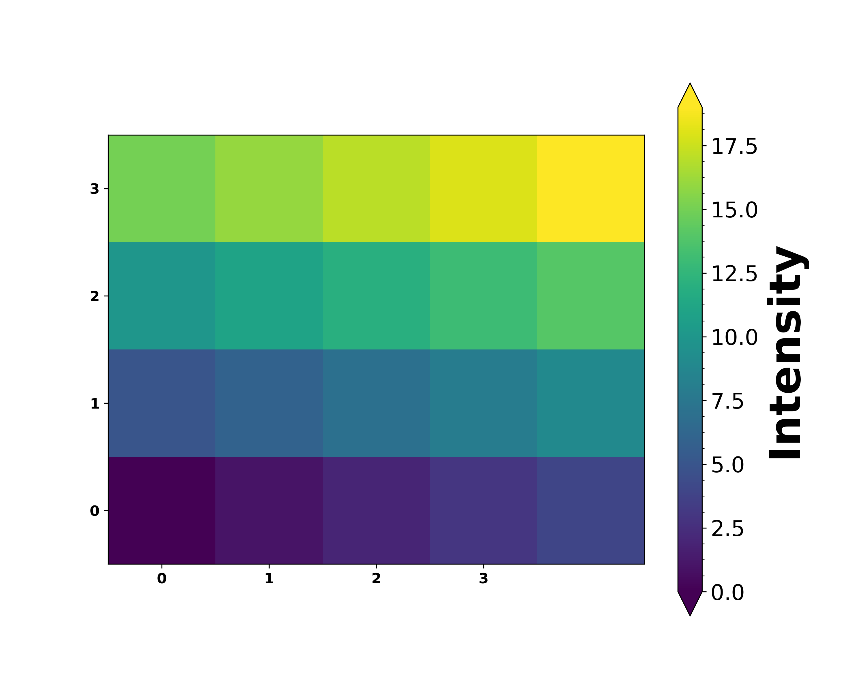
那么如何作出正确的图呢?
其实很简单,只需要改动一行代码,
cax = plt.imshow(mat, cmap='viridis', origin = 'lower')
origin 参数就是控制在左上还是在作下显示原点的参数。
origin{‘upper’, ‘lower’}, optional
Place the [0, 0] index of the array in the upper left or lower left corner of the axes. The convention ‘upper’ is typically used for matrices and images. If not given, rcParams[“image.origin”] (default: ‘upper’) is used, defaulting to ‘upper’.
Note that the vertical axes points upward for ‘lower’ but downward for ‘upper’.
上面就是这个参数的详细官方解释,其实官方还给了一个非常给力的教程,大家可以参考 origin and extent in imshow
所以我们改动后的代码效果图如下,
import numpy as np
import matplotlib.pyplot as plt

# create testing data which is 4x5 data
mat = np.arange(20).reshape(4,5)
print(mat)

# Save Image Function
fig = plt.figure(figsize=(10,8))
ax = plt.gca()
cax = plt.imshow(mat, cmap='viridis', origin = 'lower')
# set up colorbar
cbar = plt.colorbar(cax, extend='both', drawedges = False)
cbar.set_label('Intensity',size=36, weight =  'bold')
cbar.ax.tick_params( labelsize=18 )
cbar.minorticks_on()
# set up axis labels
ticks=np.arange(0,mat.shape[0],1)
## For x ticks
plt.xticks(ticks, fontsize=12, fontweight = 'bold')
ax.set_xticklabels(ticks)
## For y ticks
plt.yticks(ticks, fontsize=12, fontweight = 'bold')
ax.set_yticklabels(ticks)
plt.savefig('test.png', dpi = 300)
plt.close()
这个帖子参考了这个 Stackoverflow 的讨论 Matplotlib imshow: Data rotated?