Research Notes1: How to Plot Parity Plot?
Introduction
I have encountered this problem several times but I have not fully solved it until today when I was preparing a talk, I suddenly realized that I had to get this fixed. So after several trials and googling, I summarize all the codes you need to plot parity plot in this blog.
Parity Plot
Details can be found in Wikipedia here Parity Plot, so I will only mention some tiny pieces that will be overlooked when you just try plain Python codes to generate figures.
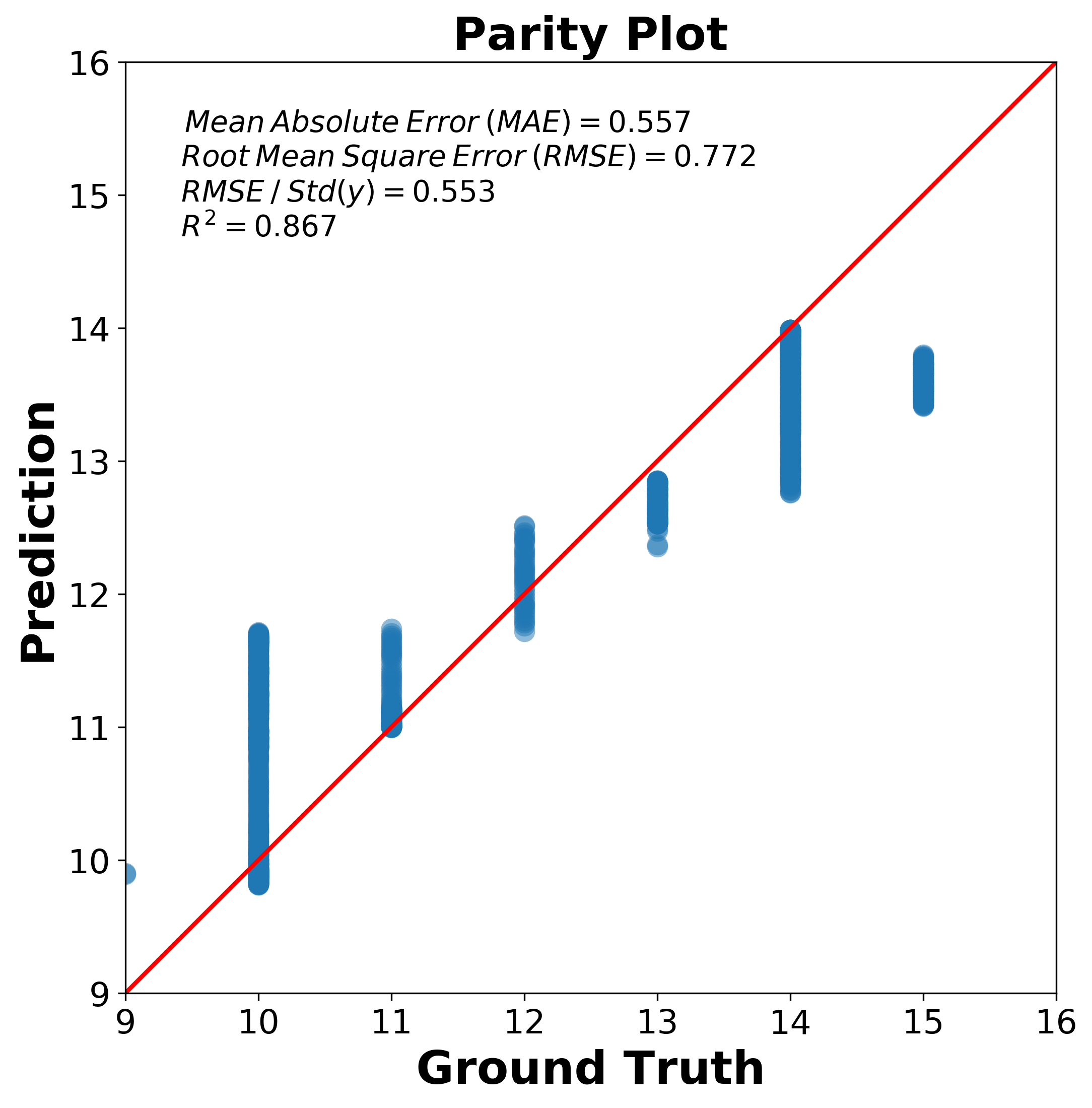
The prediction error visualizer plots the actual targets from the dataset against the predicted values generated by our model(s).
The key idea in parity plot is that if your prediction model works very well, it should lie close to the diagonal line ( 1-1 or 45 degree line ) with the ground truth value. So two things needs to be kept in mind,
- The X-Y axis should be in the same range other wise, your diagonal line may look weird.
- The X-Y tick should be same length of unit otherwise, 45 degree line may not mean the parity plot line you are looking for. For example, 10 pixel length in X axis should mean the same amount of value as 10 pixel length in Y axis.
Data and Codes
Obviously, it is easy to plot the X,Y fails in the same range cases because, it is easy to adjust, however, how about your prediction algorithm works poorly and you X,Y relationship is bad.
Well that needs to be careful, so although there are several posts online about individual pieces of how to plot parity plot but there is no integrated demos, so after check the PredictionError function in Yellowbrick document, I will use an example dataset and code to generate parity plot.
Download data and code.
The used codes is as following,
"""
[This codes show how to read in data and plot parity plot]

"""
# Import libraries

import math

import matplotlib.pyplot as plt
import numpy as np
import pandas as pd
from sklearn.metrics import r2_score

# Font for figure for publishing
font_axis_publish = {
        'color':  'black',
        'weight': 'bold',
        'size': 22,
        }
plt.rcParams['ytick.labelsize'] = 16
plt.rcParams['xtick.labelsize'] = 16

# Read in data
pred_vals = pd.read_csv("pred.csv", header=0, names=['Index','Pred'])
gt_vals = pd.read_csv("gt.csv",header=0, names=['Index','GT'])

# Plot Figures
fignow = plt.figure(figsize=(8,8))

x = gt_vals['GT']
y = pred_vals['Pred']

## find the boundaries of X and Y values
bounds = (min(x.min(), y.min()) - int(0.1 * y.min()), max(x.max(), y.max())+ int(0.1 * y.max()))

# Reset the limits
ax = plt.gca()
ax.set_xlim(bounds)
ax.set_ylim(bounds)
# Ensure the aspect ratio is square
ax.set_aspect("equal", adjustable="box")

plt.plot(x,y,"o", alpha=0.5 ,ms=10, markeredgewidth=0.0)

ax.plot([0, 1], [0, 1], "r-",lw=2 ,transform=ax.transAxes)

# Calculate Statistics of the Parity Plot
mean_abs_err = np.mean(np.abs(x-y))
rmse = np.sqrt(np.mean((x-y)**2))
rmse_std = rmse / np.std(y)
z = np.polyfit(x,y, 1)
y_hat = np.poly1d(z)(x)

text = f"$\: \: Mean \: Absolute \: Error \: (MAE) = {mean_abs_err:0.3f}$ \n $ Root \: Mean \: Square \: Error \: (RMSE) = {rmse:0.3f}$ \n $ RMSE \: / \: Std(y) = {rmse_std :0.3f}$ \n $R^2 = {r2_score(y,y_hat):0.3f}$"

plt.gca().text(0.05, 0.95, text,transform=plt.gca().transAxes,
     fontsize=14, verticalalignment='top')

# Title and labels
plt.title("Parity Plot", fontdict=font_axis_publish)
plt.xlabel('Ground Truth', fontdict=font_axis_publish)
plt.ylabel('Prediction', fontdict=font_axis_publish)

# Save the figure into 300 dpi
fignow.savefig("parityplot.png",format = "png",dpi=300,bbox_inches='tight')
The final figure shows below how