
用R做DSC曲线图
前言
前不久做了大量的DSC实验,昨天时间紧迫就使用了R作为编程语言实现了图形的绘制。
我对于这个程序的要求就是简单实际,方便和快速。同时最后的图需要美观一点。这样的需求让我选择了用R实现这个程序,虽然我知道在Origin中也一定能够实现类似的功能,但是相对而言R在Linux环境下表现更好,同时是免费。Origin的C编程没怎么学习也就不去凑热闹了。
做完的感觉,ggplot2真是R的核武器级别绘图软件,太赞了。
主要代码部分
数据格式
不同温度下的热流数据,也就是(T1,HF1),(T2,HF2),(T3,HF3),(T4,HF4)这样的一系列数据
经验总结:
- 尽量使用变量代替硬编码
- 在R这样的行列数据处理的时候,其实使用行号和列号更加方便和实用而不是硬要去使用数值查找方法,数值查找的缺点除了慢以外就是容易出现多个结果,这样就导致查找失败最终影响程序运行
- ggplot的默认设置确实是为了电脑端显示设置,很多细节的处理都不是特别好。这需要仔细体会,特别是你在幻灯片上展示自己的数据的时候。其实有明确意义的数据线和数据名称都应该加大,加粗。一般的经验38号字体左右才是在幻灯片上清晰看到横纵坐标轴名称和数据的合适大小。
代码
#load the needed library and the data file
library(ggplot2)
#setup of data processing
# you must be careful here and the end of the programe for the begining set up the parameters for caculation
#and the end for ploting
#in windows you can use read.csv("c:\\users\\JoeUser\\Desktop\\JoesData.csv")
dat<-read.csv("/home/famer/temp/DSC/Book1.csv",header=F)
colnames(dat)<-c('T1','ascast','T2','rejuvenation')
# Transfer Celsius Degrees to Kelvin Degrees plus every temperature data with 273.16
const<-273.16
dat[,seq(1,ncol(dat),by = 2)] <- dat[,seq(1,ncol(dat),by = 2)] + const
#Ts ,Te are choosen to finish the data transfer task
#below makes heat flow at Te to 0
#and R is represented the row to make the programe more efficeient to transplant to other DSC curves
Ts<-160.06+273.16
Te<-230.14+273.16
Rs<-472
Re<-735
col<-seq(2,ncol(dat),by = 2) #col:2 4 6 8 10 12 14 16 18 20 22 24
for(i in col){
hf0<-dat[Rs,i]
dat[,i]<-dat[,i]-hf0
}
#dat[,seq(2,ncol(dat),by = 2)] <- dat[,seq(2,ncol(dat),by = 2)] - dat[,seq(2,ncol(dat),by = 2)][dat[,seq(1,ncol(dat),by = 2)]==453.41]
#calculate mean of the 12 heat flow data in Te
HFmean<-0
for(i in col){
HFmean<-dat[Re,i]+HFmean
}
HFmean=HFmean*2.0/ncol(dat)
#the lineal transform formula is like the following (use col("0.5min") as example):
#col("0.5min")-[([0.05700000-(-0.01710000)]-HFmean)/(Te-Ts)]*(col(T1)-Ts)
for(i in col){
k<-(dat[Re,i]-HFmean)/(Te-Ts)
dat[,i]<-dat[,i]-k*(dat[,i-1]-Ts)
}
#Now plot the 12 pairs of data on the same plot with intervals from Ts to Te
#linesize is the parmeter to set the linesize to make the plot more pronounced
linesize<-1.5
ggplot(dat, aes(x=dat[,grep("T",colnames(dataF))], color = variable)) +
geom_line(aes(x = T1,y=`ascast`, col = "ascast"),size=linesize) +
geom_line(aes(x = T2, y=`rejuvenation`,col = "rejuvenation"),size=linesize)+
#geom_line(aes(x = T3,y=`2min`, col = "2min")) +
#geom_line(aes(x = T4, y=`4min`,col = "4min"))+
#geom_line(aes(x = T5,y=`8min`, col = "8min")) +
#geom_line(aes(x = T6, y=`ascast1`,col = "ascast1"))+
#geom_line(aes(x = T7,y=`ascast2`, col = "ascast2")) +
#geom_point(aes(x = T8, y=`ascast1`,col = "ascast1"))+
#geom_point(aes(x = T9,y=`ascast2`, col = "ascast2")) +
#geom_point(aes(x = T10, y=`ascast3`,col = "ascast3"))+
#geom_point(aes(x = T11,y=`ascast4`, col = "ascast4")) +
#geom_point(aes(x = T12, y=`ascast5`,col = "ascast5"))+
xlim(300,680)+
ylab(expression("Normized Heat Flow W/g"))+
xlab(expression(Temperature/k))+
theme_gray(base_size = 38, base_family = "TypeLand KhangXi Dict Trial")+
theme(legend.text=element_text(size=25,family = "TypeLand KhangXi Dict Trial"),axis.title.x=element_text(face="bold"),axis.title.y=element_text(face="bold"))
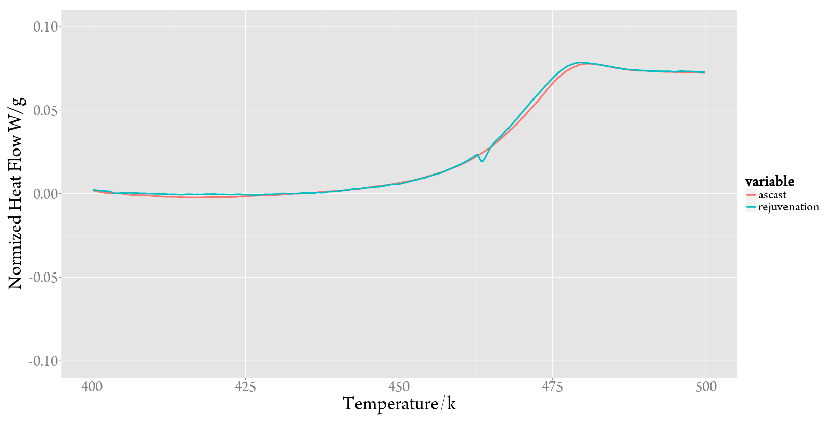
#To get the local characteristic of the data
ggplot(dat, aes(x=dat[,grep("T",colnames(dataF))], color = variable)) +
geom_line(aes(x = T1,y=`ascast`, col = "ascast"),size=linesize) +
geom_line(aes(x = T2, y=`rejuvenation`,col = "rejuvenation"),size=linesize)+
#geom_line(aes(x = T3,y=`2min`, col = "2min")) +
#geom_line(aes(x = T4, y=`4min`,col = "4min"))+
#geom_line(aes(x = T5,y=`8min`, col = "8min")) +
#geom_line(aes(x = T6, y=`ascast1`,col = "ascast1"))+
#geom_line(aes(x = T7,y=`ascast2`, col = "ascast2")) +
#geom_point(aes(x = T8, y=`ascast1`,col = "ascast1"))+
#geom_point(aes(x = T9,y=`ascast2`, col = "ascast2")) +
#geom_point(aes(x = T10, y=`ascast3`,col = "ascast3"))+
#geom_point(aes(x = T11,y=`ascast4`, col = "ascast4")) +
#geom_point(aes(x = T12, y=`ascast5`,col = "ascast5"))+
xlim(400,500)+
ylim(-0.1,0.1)+
ylab(expression("Normized Heat Flow W/g"))+
xlab(expression(Temperature/k))+
theme_gray(base_size = 38, base_family = "TypeLand KhangXi Dict Trial")+
theme(legend.text=element_text(size=25,family = "TypeLand KhangXi Dict Trial"),axis.title.x=element_text(face="bold"),axis.title.y=element_text(face="bold"))
#some testing code, you can ingore
#but they are useful when you want to encounter something strange or wrong
#dat[,2][dat[,1]==Te]
#dat[,4][dat[,1]==Te]
#dat[,6][dat[,1]==Te]
#dat[,8][dat[,1]==Ts]
画图结果
这是最终确定的下次画图就要使用的ggplot换图程序。
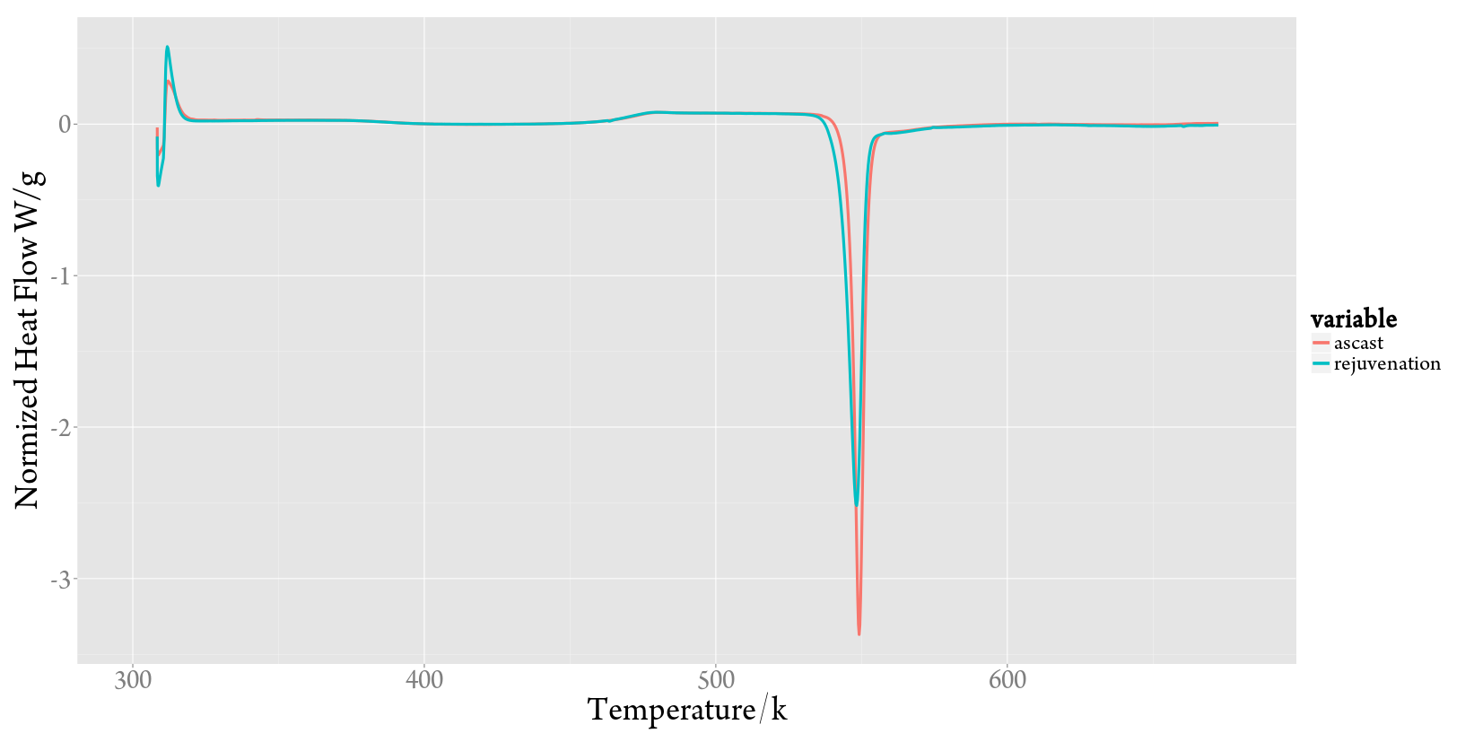
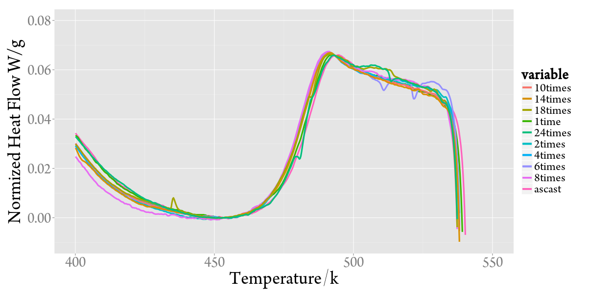
多条曲线,这也是R程序最有效率的时候
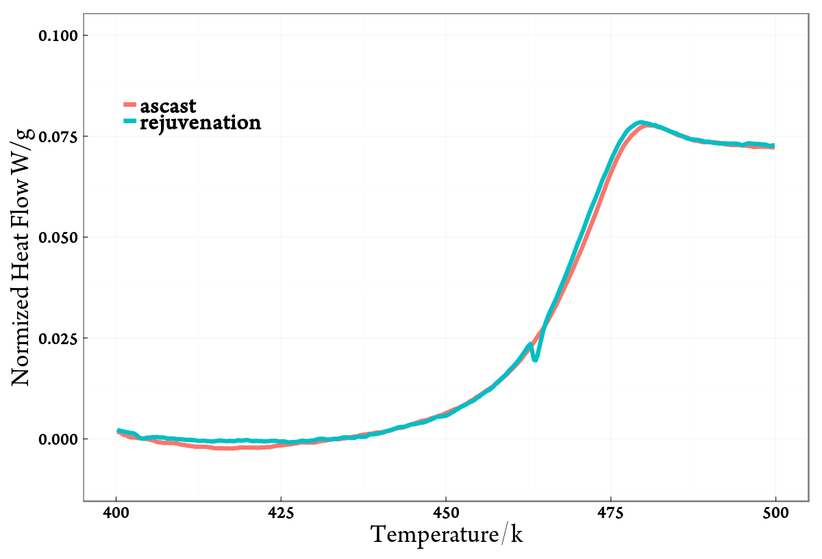
最终确定的方案
后来和同学讨论中,同学又一次提到了很多的需要修改的部分,现在终于把这些都实现了,最后的实现总结在下面。甚至给ggplot作者Hadley写信了。
#load the needed library and the data file
library(ggplot2)
library(grid)


#setup of data processing
# you must be careful here and the end of the programe for the begining set up the parameters for caculation
#and the end for ploting

#in windows you can use read.csv("c:\\users\\JoeUser\\Desktop\\JoesData.csv")

dat<-read.csv("/home/famer/HeatCycle/data/DSC/Book1.csv",header=F)
colnames(dat)<-c('T1','ascast','T2','rejuvenation')

# Transfer Celsius Degrees to Kelvin Degrees plus every temperature data with 273.16
const<-273.16
dat[,seq(1,ncol(dat),by = 2)] <- dat[,seq(1,ncol(dat),by = 2)] + const

#Ts ,Te  are choosen to finish the data transfer task
#below makes heat flow at Te to 0
#and R is represented the row to make the programe more efficeient to transplant to other DSC curves
Ts<-160.06+273.16
Te<-230.14+273.16
Rs<-472
Re<-735


col<-seq(2,ncol(dat),by = 2) #col:2  4  6  8 10 12 14 16 18 20 22 24
for(i in col){
  hf0<-dat[Rs,i]
  dat[,i]<-dat[,i]-hf0
}

#dat[,seq(2,ncol(dat),by = 2)] <- dat[,seq(2,ncol(dat),by = 2)] - dat[,seq(2,ncol(dat),by = 2)][dat[,seq(1,ncol(dat),by = 2)]==453.41]

#calculate mean of the 12 heat flow data in Te
HFmean<-0
for(i in col){
  HFmean<-dat[Re,i]+HFmean
}
HFmean=HFmean*2.0/ncol(dat)

#the lineal transform formula is like the following (use col("0.5min") as example):
#col("0.5min")-[([0.05700000-(-0.01710000)]-HFmean)/(Te-Ts)]*(col(T1)-Ts)

for(i in col){
  k<-(dat[Re,i]-HFmean)/(Te-Ts)
  dat[,i]<-dat[,i]-k*(dat[,i-1]-Ts)
}

#Now plot the 12 pairs of data on the same plot with intervals from Ts to Te
#linesize is the parmeter to set the linesize to make the plot more pronounced
#please you can choose the font type you want to use but please insure that you have 'TypeLand KhangXi Dict Trial' the font that use as default

linesize<-3

#To get the local characteristic of the data
ggplot(dat, aes(x=dat[,grep("T",colnames(dataF))], color = variable)) +
  geom_line(aes(x = T1,y=`ascast`, col = "ascast"),size=linesize) +
  geom_line(aes(x = T2, y=`rejuvenation`,col = "rejuvenation"),size=linesize)+
  #geom_line(aes(x = T3,y=`2min`, col = "2min")) +
  #geom_line(aes(x = T4, y=`4min`,col = "4min"))+
  #geom_line(aes(x = T5,y=`8min`, col = "8min")) +
  #geom_line(aes(x = T6, y=`ascast1`,col = "ascast1"))+
  #geom_line(aes(x = T7,y=`ascast2`, col = "ascast2")) +
  #geom_point(aes(x = T8, y=`ascast1`,col = "ascast1"))+
  #geom_point(aes(x = T9,y=`ascast2`, col = "ascast2")) +
  #geom_point(aes(x = T10, y=`ascast3`,col = "ascast3"))+
  #geom_point(aes(x = T11,y=`ascast4`, col = "ascast4")) +
  #geom_point(aes(x = T12, y=`ascast5`,col = "ascast5"))+
  xlim(400,500)+
  ylim(-0.01,0.1)+
  ylab(expression("Normized Heat Flow W/g"))+
  xlab(expression(Temperature/k))+
  theme_bw(base_size = 38, base_family = "TypeLand KhangXi Dict Trial")+
  theme(legend.position=c(0.15,0.8),legend.text = element_text( size = 35, face = "bold"),legend.title=element_blank(),legend.key=element_rect(size=0.01),panel.border=element_rect(size=1.5))+
  theme(axis.text.x=element_text(size=25, vjust=-0.25, color="black",face="bold"))+
  theme(axis.text.y=element_text(size=25, hjust=1, color="black",face="bold")) +
  theme(axis.ticks=element_line(color="black", size=0.5)) +
  theme(axis.ticks.length=unit(-0.25, "cm"))+
  theme(axis.ticks.margin=unit(0.5, "cm"))


#Ugly but sometimes useful commands
#axis.line = element_line(size = 1)
#legend.background = element_rect(fill="gray90", size=.4, linetype="dotted")
#legend.position = c(.85,.7)
#,panel.grid=element_blank()

#some testing code, you can ingore
#but they are useful when you want to encounter something strange or wrong
#dat[,2][dat[,1]==Te]
#dat[,4][dat[,1]==Te]
#dat[,6][dat[,1]==Te]
#dat[,8][dat[,1]==Ts]
最后的画图结果如下:
Written on November 24, 2014